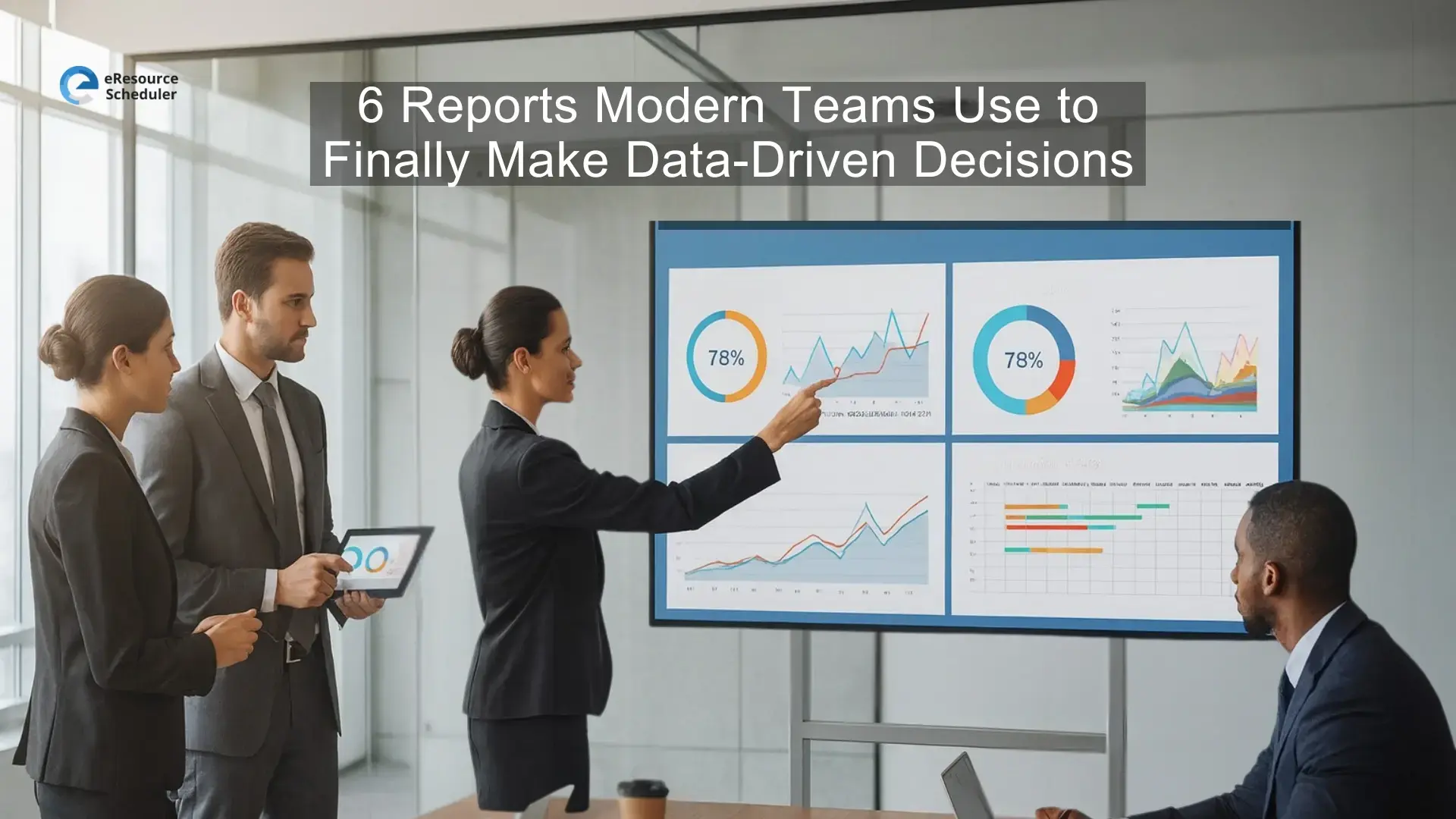
Most workplaces today handle more data than ever, yet teams still feel like they are guessing. Leaders check dashboards, review sheets, and scroll through endless updates, but the real story behind the numbers often stays hidden. That is why making stronger data-driven business decisions has quietly become the biggest advantage a company can build.
The shift is real. Managers want answers they can trust, not scattered inputs that send them in circles. They want to see what is working, what is slipping, and what needs attention before issues grow. This is where a solid reporting foundation becomes essential. When teams start using the right resource planning software, they finally move away from guesswork and toward clarity that supports every project, every team member, and every long term plan.
The right reports do not just show data. They show what the business should do next.
Most teams think they have enough data until a real decision needs to be made. That is usually the moment everyone realizes how many numbers exist but how few answers they actually deliver.
Picture a manager staring at multiple sheets, dashboards, and messages, trying to understand why a project is slipping. Everything looks “fine” on paper, yet deadlines feel tight, people feel stretched, and no one can pinpoint what changed. It is a common situation in today’s fast-moving workplace.
Raw data does not guide decisions. Interpreted data does. Until teams understand what their numbers are saying, even the best tools feel underused and most decisions feel reactive instead of confident.
Most teams don’t struggle because they lack effort. They struggle because the picture they see daily is incomplete. This is where the right reports change everything by showing what is actually happening instead of what everyone assumes is happening.
eResource Scheduler is a resource planning software that helps teams read their data clearly. It shifts the view from scattered numbers to meaningful patterns that explain where time goes, how work is distributed, and which projects need attention sooner rather than later.
This is the report that shows who is overworked, who has room to take on work, and where effort is disappearing. Managers use it to understand workload health before projects hit a breaking point.
This helps teams see future demand compared with available hours. It highlights upcoming shortages, upcoming overloads, and upcoming imbalances that spreadsheets often hide until it is too late.
They reveal pressure before it turns into delays, burnout, or project risks. They act like an early warning system that makes every other decision easier.
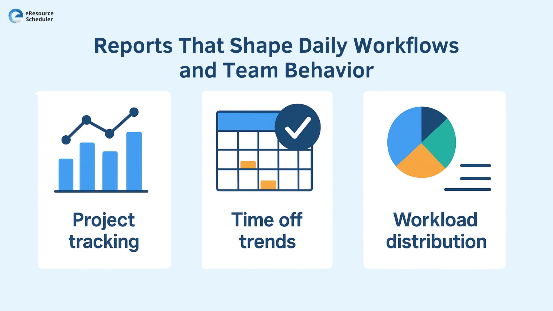
Teams may plan their week with the best intentions, but real work rarely follows the script. That is why certain reports matter more than others. They reveal the small shifts in workflow that quietly impact deadlines, team capacity, and the pace of delivery.
This report gives managers a real view of how work is moving every day. It shows which tasks are moving as expected, which ones are slipping, and which projects need support. Instead of waiting for weekly updates, teams can respond as changes happen.
On the surface, time off seems simple to track. In reality, patterns matter more than individual days. A rise in last minute leave, a team taking time off at the same time each month, or overlapping vacations can completely reshape capacity. This report helps leaders anticipate those patterns before they affect timelines.
Teams that rely on a capacity scheduling solution use this level of visibility to organize upcoming workloads more confidently and avoid surprises that slow work down.
Even the best projects drift. Sometimes it is a delayed task, a rushed handoff, or an estimate that looked right until real work started. These small shifts rarely feel urgent in the moment, yet they are the exact signals that turn into budget pressure later. This is the point where smarter reporting stops being optional.
Schedules always look perfect on day one. What actually happens during the week is a different story. When a report compares what was supposed to happen with what played out, the truth becomes hard to miss. You see the slow creep of extra hours, the surprise workload spikes, and the pace differences that quietly reshape timelines. This is where the earliest warning signs live.
Every hour has a financial consequence. Once teams start watching how hours translate into cost, a clearer pattern forms. You begin to see which projects are drifting toward overruns, which tasks are consuming more budget than expected, and where hidden costs are stacking up long before they appear on formal reports.
Teams using a resource allocation system rely on this view to adjust early, protect margins, and stay ahead of risks that spreadsheets cannot catch in time.
When these six reports become part of daily operations, the way teams work starts to feel different. People stop scrambling for answers because they can finally see what is shifting beneath the surface. Workloads feel more balanced, timelines feel more realistic, and conversations become clearer because everyone is working from the same understanding of what is actually happening.
This kind of visibility changes more than just planning. It creates steadiness in fast cycles and brings a level of predictability that most teams don’t realize they’re missing until they experience it.
Book a personalized eResource scheduler demo and see how this clarity can help your team make smarter decisions, stay ahead of problems, and work with the confidence that comes from truly understanding their day to day reality.
1.Which reports help teams make better decisions?
The most helpful reports are the ones that show how work is moving, how capacity is shifting, and how actual hours compare with plans. They highlight patterns that affect timelines, workload balance, and overall performance, making it easier for teams to respond early instead of reacting too late.
2.How often should teams look at capacity or utilization data?
Most teams benefit from reviewing this data weekly because workloads change quickly in modern operations. A weekly check helps managers catch early signs of overload or underuse, understand shifting priorities, and adjust assignments before those changes affect timelines or slow down important projects.
3. How do reports improve time off planning?
Reports help identify patterns in time off, such as seasonal peaks, recurring last minute leave, or overlapping vacations. Understanding these trends helps managers plan workloads more accurately, maintain smoother schedules, and avoid sudden capacity drops that could disrupt active work or delay important milestones.
4. Why are planned vs actual numbers important?
Comparing planned hours with actual hours reveals how closely real work matched expectations. Small differences often point to underestimated tasks, shifting priorities, or early signs of bottlenecks. This comparison helps teams adjust sooner, protect timelines, and keep projects realistic rather than overly optimistic.
5. What should a reporting tool offer smaller teams?
A good reporting tool for smaller teams should provide clear views of workloads, capacity, project progress, and differences between planned and real work. These basics give leaders enough clarity to spot changes early, maintain balanced schedules, and make informed decisions without needing complex or heavy systems.


Plan Smarter. Schedule Faster. For Free.
Join thousands already using eResource Scheduler to align teams, time, and tasks seamlessly.
 ALL FEATURES INCLUDED